Wednesday, December 9, 2009

"Artforum" (December 2009)

Today, for my last journal entry, I will be writing about the December 2009 issue of Artforum, which is the "Best of 2009" issue. Looking at the table of contents page, I see that this magazine reviews films, music, dance, books, and art. And a name has already caught my eye: Charlotte Gainsbourg. I know (and love) her as a French actress, but here in Artforum, she is being written about as a musician, which I did not know she was. Anyway, I really like this magazine; it's big and the pages are glossy, and it seems to offer quite a bit in the different areas it covers.

In flipping through, I have discovered an interesting section entitled "The Artists' Artists." It's a spread of many pages in which artists write very brief descriptions of what they think is the "Best of 2009." And a few pages in, I have stumbled upon an account of an artist seeing Robert Smithson's Spiral Jetty (1970), which we studied in class and will most likely be on the final tomorrow. Apparently, Florian Maier-Aichen, the artist, saw Spiral Jetty resurface during a fall in water levels after the work had been underwater for nearly four decades.

Robert Smithson, Spiral Jetty, 1970

After looking through that feature, I am coming across pages upon pages of exhibit advertisements. I could literally look through these for hours, which is pretty overwhelming. But now I have found a feature in which thirteen scholars choose their very own top ten best art moments, pieces, or exhibits of the year. And I see that Christine Macel, the chief curator of contemporary art at the Centre Pompidou in Paris, has chosen Roman Ondak's latest exhibit as her number one art highlight of the year. This is interesting to me because I wrote about Ondak's art in my December 2nd entry, which was about the December 2009 issue of Flash Art. This is now the second time that I have discovered an artist while writing in this contemporary art journal, only to come across the artist a second time (the first case was Beatriz Milhazes)! And a few pages later, Matthew Higgs, an artist and curator in New York, chooses Roman Ondak's art as his number five highlight of 2009. It seems that in reading about Ondak last week in Flash Art, I really came across someone to be watching in the future as he appears to be very popular.

And now, after arriving at the final section of the issue, reviews, I see a review on the multiple reinventions of Allan Kaprow's Yard (1961). This seems to be a fitting way to end my contemporary art journal: writing about more contemporary reinventions of a piece of contemporary art that we studied in class this semester.

Allan Kaprow, Yard, 1961

Allan Kaprow's original Yard, as shown above, was first exhibited at the Martha Jackson Gallery in New York City, on the Upper East Side, the same location that currently houses William Pope.L's 2009 reinvention of Yard. Before Kaprow's death in 2006, he exercised tight control over the exhibition of Yard, "insisting on reconceiving his environments each time they were shown." However, following his death, artists were finally given the freedom to put their own unique spin on Yard. Pope.L's reinvention, although at the Martha Jackson Gallery, is not exhibited at the exterior site that Kaprow used, because it was built over quite a few years ago. Instead, Pope.L utilizes the entire first floor of the building. Pope.L says that his reinvention has a lot to do with death: the implied environmental decay, the presence of body bags, and Kaprow's absence.

William Pope.L, Yard (To Harrow), 1961/2009

Another reinvention of Yard, that of artist Josiah McElheny, was inspired by Kaprow's speculation about perhaps bringing his audience to the junkyard instead of transporting the tires to Manhattan. In McElheny's reinvention, visitors to the Queen's Museum saw photographs of Willets Point, a nearby area of waste activity, projected onto a wall.

Josiah McElheny, Yard (Junkyard), 1961/2009

All in all, this review shows that beyond Kaprow's recreations of his own work, artists today are continuing to alter and reinvent his work, showing that Yard is an ever-changing piece. To me, this article has been an interesting look at reinventions within contemporary art because when I think of recreations in art, I imagine artists recreating works from long ago. However, it is now clear to me artists are reinventing works made within the past 50 years. I think this is a good close to my journal as it reveals that contemporary art is vibrant and very much alive.

Buskirk, Martha. "Allan Kaprow, Yard." Artforum 68 (2009): 226.

Tuesday, December 8, 2009

"Parkett" (2009)

Today I am looking at Parkett magazine, and it appears as though this magazine comes out just once a year because this issue just seems to be the 2009 issue, not a specific month or season of 2009. Parkett is quite large in comparison to the other magazines I've read while keeping this journal, and thus, feels a bit overwhelming. However, this should be an interesting issue to look through because it marks the 25th anniversary of Parkett magazine. The table of contents page is somewhat confusing, so my plan is to flip through the pages and see what I find.

And now I'm discovering why this magazine is so much larger than the others I've read: each article is printed in both English and German. To me, that is very cool. Too bad the second language isn't French! What is even more interesting is the fact that different images accompany the two articles (English version and German version), so for someone who does not speak German, he or she can still examine the images that are included in the original (German) text. This seems to go back to the whole issue of the accessibility of art, something that we have discussed in class and that I've seen further in a few of the articles I've read while keeping this journal.

And now I've stumbled upon an English translation of an interview that looks interesting. It is an interview with Beatriz Milhazes, an artist I first discovered when reading and writing about the November/December 2009 issue of Art on Paper on November 20th. In that issue, I saw one of her works (Batucada, 2009) featured as one of the most compelling prints published worldwide over the past year, and instantly liked it enough to want to purchase it, so I am very excited to read the English translation of this interview, and to look at the works featured in the original German text.

Beatriz Milhazes, Batucada, 2009

From the very start of the interview with Beatriz Milhazes, I am interested and intrigued. She discusses her fascination with Mexican culture, though she is Brazilian, and reveals that Frida Kahlo served as an influence on her art in the late 1980s in her use of ruffles and lace as adornments, and the depiction of flowers as more than just decoration, but also as something that holds an important role in the rituals of weddings and funerals. I'm noticing that Milhazes uses the word "fantasy"/"fantastic" a great deal when talking, and I can see how this is portrayed in her work. Also of interest is the fact that Milhazes states that "music defines the notion of soul", yet she prefers to create her works in silence because while working, she listens to "the rhythm of the painting." Milhazes also kind of sets the record straight in terms of her works being seen as sensual. She says that she knows that everyone considers her work to be very sensual, but her work is actually a lot about geometry and "how geometry structures life."

Milhazes also references Yves Klein in her discussion of the use of color in her works. She says that she learned that Klein once said that adding one color to another creates endless conflict, and that it is this conflict that she wants to start, a conflict with no winners, when she creates relationships between colors in her art. And in returning to Milhazes's love of music, she informs the reader that the titles of her works are separate from the works themselves--the titles are related to songs and lyrics. She says that her titles do not attempt to explain the works because words are dangerous and can "ruin the freedom of an image." And toward the end of the interview, the interviewer, Arto Lindsay, brings up the fact that Milhazes has begun to work with other mediums outside of painting to create stained glass windows and collages, and Milhazes responds by saying that working with different media inspires her and allows her to bring new questions into her paintings.

Beatriz Milhazes, Peace and Love, 2005, Gloucester Road Station Project Platform for Art Underground, London

Reading this interview has been very interesting because I have learned a great deal more about an artist I first discovered a few weeks ago. I think it is very cool that because of this art journal, I have discovered a contemporary artist whose work I really like, and have now been able to read an interview with her!


Lindsay, Arto. "Musical Expression: Arto Lindsay in Conversation with Beatriz Milhazes." Parkett 85 (2009): 132-137.

Friday, December 4, 2009

"Art on Paper" (September/October 2009)

Because of our class discussion yesterday on Art in the Age of Terror, today I'm going to write about an article in the September/October 2009 issue of Art on Paper which is entitled "Keeping the Message Alive", and is about the twentieth anniversary of The Center for the Study of Political Graphics which is based in Los Angeles.

The article begins by positing that we are seeing a revival in the creation and production of political posters and that at least part of the credit should go to George Bush and the Iraq War because an increase in political poster production of this magnitude has not been seen since the Vietnam War. And the Center for the Study of Political Graphics (CSPG) has been collecting these posters, which come from all over the world.

Lambert Studios, Inc., War is Good Business, 1969

What makes the CSPG different from other political poster archives, such as the Hoover Institution at Stanford University, is that its collection focuses on post-WWII materials, making it one of the largest contemporary political poster collections in the world. "...at least ninety percent of the collection dates from the 1960s to the present and focuses on popular movements rather than government or corporate propaganda."

Favianna Rodriguez/Code Pink, Make Out Not War, 2008

Another unique characteristic of the CSPG is its two criteria for poster submission: works must be overtly political and must be produced as multiples. This gives people the opportunity to create and submit their own hand-made signs as long as they also reproduce and distribute the signs so that their messages will be seen in more places. Essentially, the CSPG emphasizes the grassroots nature of its organization, and also its progressive nature. For example, the CSPG does a variety of exhibits including shows on broad topics such as war, immigration, labor, and racism, or more specific exhibits such as the legacy of Che Guevara, the death penalty, and the ongoing murders of women in Juarez, Mexico. And thus although most of the posters in CSPG's collection are progressive, they also have a collection of right-wing posters.

Carol Wells, the founder and executive director of the CSPG, talks in the article about the power of political posters and gives an example of one of the most powerful political posters in the CSPG's collection, a 1970 poster protesting the Vietnam War and its killing of innocent women and children.

Frazier Dougherty, Jon Hendricks, Irving Petlin, R. L. Haeberle (photographer)/Artists Poster Committee of Art Workers Coalition; Q. And Babies? A. And Babies; 1970

This poster is a combination of Robert L. Haeberle's famous photograph of the My Lai massacre and text from a CBS interview with a soldier who had participated in the massacre, during which several hundred women and children were murdered by U.S. troops. When Americans found out about the massacre, the American sentiment toward the war went from support to opposition. Wells says that while television images are fleeting, posters keep history alive. Thus, the CSPG's main goal is to collect posters, yet ensure that they are always out in the public eye.

This article definitely relates to our class discussion yesterday of Art in the Age of Terror. In my group, we discussed the climate of fear and how the government depends on war and the climate of fear so that we will continue to depend on the government for some sense of security, safety, and protection . And so although the posters at the CSPG "keep history alive", I believe they could serve to do away with this climate of fear if we could all see the anti-war posters. Looking at the anti-war posters featured in this article, I felt empowered and felt the need to take action. This is somewhat similar to our class discussion of identity art, such as art about the HIV/AIDS crisis, the government's lack of action, and the public's ignorance toward the virus. The posters we saw in class that day had the power to open people's eyes: kissing does not spread the HIV/AIDS virus, the government does not help those with HIV/AIDS receive treatment, etc. The messages contained in each of those works of art inspired action in one way or another. So, in the same vein, the posters I saw in this article (the ones I have posted in this entry), seem to serve to open our eyes to war and its completely unnecessary nature, yet at the same time, its tragic nature, and our need to take action. Therefore, I think these posters could change or put a new spin on the concept of the climate of fear and war in general. The posters have the ability to show us that war is something to be feared, but not in the way we currently fear war. The climate of fear instills in us this sense that we should fear for our lives and thus, we should rely completely on the government to protect us, the same people who create the climate of fear. Instead, we should fear for the welfare of the soldiers and for the innocent civilians who are in danger of losing their lives each day. And then we should take this fear and translate it into action!

Mizota, Sharon. "Keeping the Message Alive." Art on Paper 14 (2009): 44-55.

Thursday, December 3, 2009

"Woman's Art Journal" (Fall/Winter 2009)

Today was the last day of class (Art Since 1945), and although I am thinking about and preparing for the final, I'm also thinking about the art history class I will be taking next semester, Gender and Art, so today I'm going to write about the Fall/Winter 2009 issue of Woman's Art Journal.

It seems that some of the art shown and written about in this magazine is not necessarily contemporary, such as the cover art, which is Paula Modersohn-Becker's Self-Portrait, Age 30, 6th Wedding Day (1906). However, the magazine also contains a great deal of recent reviews, so I'm going to focus on that part of the issue. In fact, there's a review of Louise Bourgeois's latest exhibition catalogue which looks interesting. I remember Louise Bourgeois being mentioned in class at some point this semester, however, I cannot seem to find her listed on any of our class handouts. Maybe my memory will be jogged while writing this entry and I will remember when and in what context we studied Bourgeois this semester. Another thing I remember being mentioned in class is Linda Nochlin's essay entitled "Why Have There Been No Great Women Artists?" (1971), which happens to be referenced in this review.

Louise Bourgeois, Spider, 1997

What I'm learning so far is that this catalogue is a traveling compendium, as well as a retrospective, but does not follow the typical chronological format of a retrospective. Instead it focuses on the people, places, and subjects that have served as influences on and inspirations for Bourgeois's life and art. Also, the title of the catalogue is taken from her 1999-2000 mixed-media installation, "I Do, I Undo, I Redo", which is very fitting for a retrospective that examines how and why certain subjects have become recurring themes in differing forms throughout her career.

In terms of the non-chronological layout of the catalogue, it is set up as a glossary with alphabetically-arranged entries ranging from names of family members and friends to titles of specific works to the themes in Bourgeois's life and art, such as "Abandonment" and "Abstraction." However, the author of this review says that this format, while innovative, tends to be too verbose in terms of biography, and thus works to its detriment and complicates the work itself. For example, because biography has the tendency to "heroicize the male artist-genius", the use of biography with female artists "often results in the reduction of their work to a mere visualization of personal life and positions them as exceptions to the rule in a patriarchal system." Therefore, Rachel Epp Buller, the author of this review, states that the authors who wrote the biography for this catalogue are reducing Bourgeois's work by assuming that it is merely the translation of her personal life into visual form. According to Linda Nochlin, the author of "Why Have There Been No Great Women Artists?" (1971), "art is almost never that [the translation of personal life into visual terms], great art never is."

However, Buller recognizes that this is not entirely the fault of the authors. In fact, Bourgeois herself stated that her work "can be traced in inspiration to her formative years, and particularly to the perceived double betrayal in the open affair of Bourgeois's father and nanny." One must also consider Bourgeois's spider theme and its relation to her mother, a weaver, as seen in Maman (1999). Thus, it appears that through her art, Bourgeois leads to the viewer back to her biography, so it is important to find a balance between seeing her biography as a way of understanding the influences on her art, but not relying too heavily on it to the point of reducing her art and its meaning. Also, although it is important to recognize the role of biography usage in an artist's retrospective, one must also consider Bourgeois's theme of doing, undoing, and redoing, such that none of Bourgeois's works ever stand for one single thing.

Louise Bourgeois, Maman, 1999

Buller's review goes on to cite the opinions of various writers and the extent to which they use Bourgeois's biography when writing about her art and its meaning. (Buller even happens to mention the Donald Kuspit article that we read for class, which reminds me when we studied Bourgeois this semester!) And Buller then concludes by saying that although the catalogue is too heavy on the biographical side, it is also "a feat of scholarship" that provides many more opportunities for the continuous discussion and analysis of Bourgeois's art.

Buller, Rachel Epp. "Louise Bourgeois." Woman's Art Journal 30 (2009): 54-55.

Wednesday, December 2, 2009

"Flash Art" (October 2009)

Once again, the most recent issue available is October 2009. However, this time, the magazine is Flash Art, "The World's Leading Art Magazine." I've already flipped through the issue and it seems similar to some of the other magazines I've written about. It begins with a news section, proceeds into the features section, and ends with reviews.

There's an article called "Inside the Market" that asks a series of questions to various art advisors and looks very interesting and also very different from the articles and reviews I've written about in previous journal entries. I've also come across an article called "Measuring the Universe", which is an interview with artist Roman Ondak. I'm going to do another flip through, but I think I will be coming back to this interview to read it and then write about it because the photograph on the first page of the article is very intriguing.

Roman Ondak, Measuring the Universe, 2007

And I've come back to the interview with Roman Ondak, a Slovakian artist who lives and works in Bratislava. The image above is a photograph of Ondak's performance piece, Measuring the Universe, that was shown at the Museum of Modern Art in New York in 2007. Ondak reveals in the interview that the performance began with the very first measurement and that it concluded when the last visitor was measured. The interviewer, Klaus Biesenbach, states that MoMA had Measuring the Universe for twelve weeks and sees anywhere from 5,000 to 20,000 visitors each day, each of whom may be measured and become part of Ondak's piece. This prompts Ondak to talk about the various cultural and architectural influences on Measuring the Universe. For example, this piece showed for the same amount of time at the MoMA in New York and at the Pinakothek der Moderne in Munich, but Ondak believes that each space had factors working in its favor in different ways. Whereas the room in the museum in Munich was four times larger than the room in the MoMA, the MoMA was more likely to see more visitors because of its location in New York City. The various factors that influence how many people see Measuring the Universe and get measured affect the performance aspect of the piece.

Ondak goes on to discuss the fact that he takes the tradition of recording children's heights on the wall into a public event. He calls the exhibition room "a container of the 'here and now'", and believes that this piece reveals the existence of "an invisible potential to transform the presence of people into a physical object." Clearly, this work relies heavily on viewer participation, which seems to be a theme across his art, especially when considering Measuring the Universe (2007) in relation to More Silent Than Ever (2006), an empty gallery with a label on the wall saying that there was a hidden eavesdropping device in the gallery. No one, except for Ondak himself, knows whether or not there really was an eavesdropping device in the gallery, but he says that the act of expecting and wondering about the presence of the eavesdropping device is already indicative of participation.

Roman Ondak, More Silent Than Ever, 2006

I can imagine being in that gallery, perhaps by myself or perhaps among a crowd of many people. And whether we'd like to admit it or not, we'd all be thinking about the words coming from our mouths, and what is "okay" to say. However, if we end up speaking or choose to remain silent, we are all influenced by the piece and participating in line with the influence. It's very interesting to think about.

The interviewer, Biesenbach, goes on to discuss several other works by Ondak, and concludes with Teaching to Walk (2002), a piece in which a mother brings her one-year-old child into the gallery and teaches him how to walk, how to make his first steps. Ondak made this work with the concepts of intimacy and unpredictability in mind. The instant in which a child takes his or her first steps is a very intimate moment, yet simultaneously a very unpredictable moment because of the child's age. This notion of unpredictability clearly creates an impact on the aspect of performance in the piece.

Roman Ondak, Teaching to Walk, 2002

Overall, I've very much enjoyed reading this interview and considering the aspect of performance and viewer participation in contemporary art. Hopefully someday I'll be able to see an exhibit of Ondak's work and be measured on his work, Measuring the Universe, becoming part of the art itself.

Biesenbach, Klaus. "Measuring the Universe [Interview with Roman Ondak]." Flash Art 62 (2009): 78-81.

Monday, November 30, 2009

"Art in America" (October 2009)

It appears that the more recent issues of Art in America are already in use tonight because the most up-to-date issue I could find was for October of this year. So tonight's journal entry will be about this issue. At first glance, the cover of the issue makes it look like one of those home and garden magazines. There's a kitchen table with a fruit basket on top of it and three chairs. However, that assumption quickly disappears when one notices the large and strange spiderweb to the right of the kitchen table (this, I learn later, is a zoomed in picture of a work of art by Janine Antoni). I'm interested to see what this issue has in store.

The "focus" of this issue is Nature and Culture, and the "tagline" is "Where art meets the land, and the environment stays in the picture." This issue also contains several feature articles, including features about Janine Antoni, James Ensor, Conceptualism, Paul Outerbridge, and John Baldessari, and various exhibit reviews. In looking through the table of contents, I realize that I've never heard of any of these artists, so I'm going to look at some of the exhibit reviews which are at the end of the magazine. Yesterday, I went to the Martin Zet exhibit at the Station Museum in Houston, and because I will be writing my exhibition review about this exhibit, I need to begin learning how art critics write concise, yet informative reviews.

Just for fun, I've chosen to read the two reviews of exhibits in Paris, the exhibits of artists Sergio Vega and Nalini Malani. Hopefully by examining these two reviews, I will come to a better understanding of what key ideas, principles, or techniques I should apply when writing my exhibition review.

The review of Vega's exhibit (at the Karsten Greve) is five paragraphs long, and the first paragraph reveals the title of the exhibit ("Parrot Theory") and what Vega examined in the art shown in this exhibit ("their [parrots'] complicated roles as figures of myth, metaphysics and scientific study"). The second paragraph describes the main components of the exhibit: a large green chalkboard outlining the history of parrots' symbolic representations, and a 2009 video of Vega lecturing on this outline. The third paragraph then goes into detail about the various other aspects of the exhibit that support the two main components (drawings, a parrot-shaped lamp, a 1963 advertisement for a Ford Thunderbird, etc.). The fourth paragraph highlights the importance of another room in the gallery, which includes a second video whose dialogue uses words from the Bible to say that parrots are "the quintessential witnesses of Paradise", and that in the Garden of Eden, animals spoke the universal language that God, Adam, and Eve spoke. The fifth and final paragraph refers back to the video lecture first mentioned in the second paragraph, and informs the reader why Vega first became interested in parrots with a quote from Vega himself. The main point of his quote is his interest in the large similarities between parrots and humans in the action of talking even when there is nothing to say. The writer of this review then concludes with two humorous sentences in response to Vega's quote.

Sergio Vega, Parrot Color Chart #6, 2008

The review of Malani's exhibit (at the Lelong) is four paragraphs long (or short), and in the first sentence, the author reveals three important facts: the title of the exhibit ("Cassandra"), the fact that this is Malani's first solo show in France, and that this exhibit marks the return of Malani to her roots of drawing and painting. This introduction already provides the reader with more information in the first sentence than in the first paragraph of Vega's exhibit review. The rest of the first paragraph of Malani's exhibit review contains a quote from the artist herself and a bit of biographical information on the artist, which may allow us to understand more fully her art and this review of her art. The second paragraph informs the reader that the majority of the works included in "Cassandra", are "reverse paintings" and explains what this ancient technique is, Malani's experience with it, and what effect it has on the viewer. The third paragraph specifies the influences on Malani's art, and the range of these influences from classic to contemporary, from Greek tragedies to modern theater and current events. The fourth and final paragraph describes in detail a few of the works in the exhibition and their unique characteristics. This final paragraph finishes with a description of the 30-panel centerpiece of the exhibit, which shares its name with the name of the exhibit. In the final two sentences of the review, the author compares Malani to other artists, such as Kiki Smith and Nancy Spero, and makes one final commentary on the effect that Malani's art has on its audience.

Nalini Malani, Cassandra, 2009

Through examining these two reviews, I do feel that I have gained a better understanding of what writing an exhibit review requires. Because of the excitement I felt during, and for the rest of the day following, the Martin Zet exhibit, I am eager to get started on my review.

Princenthal, Nancy. "Sergio Vega." Art in America 9 (2009): 178, 180.

Franklin, Paul B. "Nalini Malani." Art in America 9 (2009): 179.

Tuesday, November 24, 2009

"Sculpture" (December 2009) Part II

Today in class we studied abjection and the body, so I'm going to keep that in mind as I continue what I started last night, looking through the December 2009 issue of Sculpture.

As I've been looking through the issue over the past few minutes, I've noticed one feature and one exhibition review that seem to connect with today's class discussion. I'll start with the exhibition review since it is a great deal shorter. The artist is Ana Teresa Fernandez and the exhibit is at the Galeria de la Raza in San Francisco. What drew me to the exhibition review was a photograph of her work Untitled 1 (2008). This work resembles a human body, sitting, and is made out of beer bottle shards, lights, and resin. Ana Teresa Fernandez calls her exhibit "ECDISIS", which means shedding of the skin, and the background behind the works exhibited is that Fernandez uses life-size resin casts to create the bodies of young orphan girls. However, the reviewer believes that the power of Fernandez's art is so strong that "her work is evocative with or without the back-story." These young orphan girls represent the young women of Juarez, who have disappeared, been abused, been murdered, and been dismembered since 1992, when work opportunities first drew women to this border town. The women were offered steady work for steady pay which meant independence for them, a rare opportunity. However, this independence also weakened familial ties opening up the possibility of being easily exploited by others.

Ana Teresa Fernandez, Untitled 1, 2008

Considering our study of abjection and the body today in class, Fernandez's works seem to relate. These images clearly represent the abuse and murder of the women in Juarez, trauma that leads to abjection.

I am now moving on to a feature (that may or may not relate to our class discussion as well as Fernandez's works do) about Christine Bourdette's work, entitled "Clues to the Riddle of Human Experience." The very first page is entirely covered with an image of one of Bourdette's works, Asides (2004-07), a photograph of faceless bodies (made of leather, wood, cardboard, pigment, and wax) standing upright, but without arms. After turning the first page and seeing the start of the text, I learn that this exhibit is a mid-career retrospective at The Art Gym on the Marylhurst University campus. The author, Lois Allan, who looked through 50 of Bourdette's sculptures remarks that "almost every one of the 50 sculptures attested to some aspect of the human body, or its presence." This definitely ties in with today's class topic. Allan goes on to state that Bourdette's sculptures are "charged with ambiguity, mystery, and psychological depth." In this way, Bourdette's sculptures relate to several works we studied today such as Kiki Smith's The Sitter (1992), Blood Pool (1992), and Untitled (1992). Another similarity between Bourdette and Smith, although more superficial, is their use of neutral, natural colors. However, where Bourdette's works begin to branch out on their own is in the concept of community which may be portrayed in her works. For example, Bourdette often groups sculptures to convey a sense of community and relationships.

Two of the ten figures in Asides, Christine Bourdette, 2004-07

Kiki Smith, Blood Pool, 1992

Kiki Smith, Untitled, 1992

Kiki Smith, The Sitter, 1992

I expected the author to go more in depth as to why Bourdette's sculptures are faceless and often lacking limbs, but the author offers just the suggestion that it is Bourdette's way of focusing on gesture and movement. Somehow, I'm thinking there has to be more behind the faceless, limbless sculptures than this reasoning.

Allan gives the reader a bit more insight into Bourdette's work by saying that although it is impossible to categorize or classify her work, one of the influences on her work was Eva Hesse "for her experimentation with materials, forms, and unusual configurations." This kind of makes me laugh because last night I was trying to establish a connection between Eva Hesse and another artist (Damian Ortega), and here today, the connection actually exists.

At the very end of the article, Allan finally addresses, in detail, the work on the first page, Asides. Allan writes that this work consists of ten nearly life-size figures, lacking arms and features, that seem to be searching for something as they bend and look downward. "If we assume that together they are searching for something, we can interpret the piece as representing a societal, timeless, nameless search." In this vein, one can see similarities between this piece and some of the works we studied in class today as relating to the concept of abjection. If abjection is about returning to a stage in development where the "self" does not yet exist, then Asides definitely connects with this concept. The figures are faceless, and therefore cannot be distinguished from each other, suggesting that each lacks a "self", and what they are searching for is unknown.

I've definitely found this journal interesting and I'm glad I was able to find connections between the works cited in this issue and the works we studied in class today. This was definitely a thought-provoking entry for me, and I'm interested to see what I'll be writing about next.

Allan, Lois. "Clues to the Riddle of Human Experience." Sculpture 28 (2009): 26-31.

Monday, November 23, 2009

"Sculpture" (December 2009)

Tonight I'm looking at the December 2009 issue of Sculpture. The features of this issue are various articles about Christine Bourdette, Lutz Fritsch, Gahae Park, Richard Rezac, Helen Escobedo, and Andrew Rogers. This issue also contains several reviews of exhibits from London to New York to San Francisco to Boston to Buenos Aires...and then all the way from Davidson, North Carolina to Virserum, Sweden. Clearly, this issue has a lot to offer in terms of diversity and international perspective.

I don't know much about sculpture and I've never heard of any of the mentioned artists, so I'm just going to look through the journal casually. While flipping through, I noticed a photograph of a piece of art that looks familiar, but it turns out this is not the piece I was thinking of. What I'm looking at is Damian Ortega's Piel/Skin, and what I'm thinking of is Eva Hesse's Rope Piece, which we examined during our study of post-minimalism.


Damian Ortega's Piel/Skin (2006-07) and Eva Hesse's Rope Piece (1970)

Now that I'm looking at the two works, side by side, I don't see as many similarities as I thought would be present, but I'm still proud of myself for seeing one work of art and instantly thinking of another. Perhaps there is a relationship between the two, or maybe I'm just reading into Ortega's sculpture. Not much information about Ortega or his work is provided, but it does say that Ortega was trained as a political cartoonist and therefore "uses ironic humor to undermine preconceived ideas about art while addressing questions of social organization, environmentalism, post-industrialization, and urban development." I think I would have to go to his exhibit in Boston to gain a fuller understanding of his work, but at least one commonality I see between Ortega and Hesse, albeit very simple, is the use of common-place objects in creating art. The brief blurb about Ortega's exhibit (at the Institute of Contemporary Art in Boston through January 18, 2010) also states that "...these reshaped and rethought everyday objects [Ortega's sculptures] dissolve into dynamic new configurations that underscore the perpetual uncertainty and flux of life." So I'm not seeing a direct connection between Ortega and Hesse, but I do see similarities. Beyond their common use of everyday objects, the concept of the uncertainty and flux of life is definitely something that may have influenced Hesse's work considering her life events: fleeing Nazi Germany as a child, her parents' divorce, her mother's suicide, her failed marriage, the death of her father, and her brain tumor, and overall, the fight for recognition in the male-dominated art world. So it is possible that a relationship exists between Ortega's Piel/Skin and Hesse's Rope Piece despite the gap of almost 40 years between the two works.

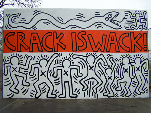
Two pages later, I see a photograph, and this time I correctly recognize the artist! The photograph is of Keith Haring's Pop Shop, an artist I know because of his affiliation with Best Buddies (one of his works serves as the official logo for Best Buddies International).


Keith Haring's Pop Shop (1986) and Best Buddies (1990)

I wish the exhibit description that goes with this photograph would talk more about Keith Haring and his work, but he is hardly mentioned, probably because the exhibit (at Tate Modern in London through January 17, 2010) is entitled "Pop Life: Art in a Material World" and focuses not just on the art of Keith Haring, but on the work of several artists, such as Jeff Koons, Takashi Murakami, Damien Hirst, Tracey Emin, and Martin Kippenberger. The mission of this exhibit is "to radically rethink Pop at its legacy by focusing on how, since the 1980s, artists have engaged with the mass media and cultivated signature personas." Though I am not familiar with the other artists mentioned, I am somewhat familiar with Haring's work and therefore, I can see how he engaged with the media and developed his own persona during the 1980s. After all, it was during the 80s that Haring opened the Pop Shop to sell products with his images on them, and it was also during the 80s that Haring created works with social messages. Haring's signature persona seems to be the faceless people featured in his works and his engagement with the media focused on raising awareness about various social problems. This definitely sounds like an exhibit I would go to if I were in London.


Somehow I've spent almost two hours writing this entry and I haven't even made it to the features of the issue yet. I'm going to go ahead and end this entry here and come back tomorrow to look through the rest of the December 2009 issue of Sculpture.

Friday, November 20, 2009

"Art on Paper" (November/December 2009)

My entry this afternoon will be about the November/December 2009 issue of Art on Paper. I'm interested to see how it compares to Art Journal and ARTnews, and what I will learn from reading it today.

I know this is probably meaningless, but for some reason, I like the fact that it's smaller than the other two journals I've read this week. It appears to be about 8 by 6 inches, so it's nice and small. It starts with a few exhibit ads and then goes straight to the Table of Contents page, which gives information about this issue's features, columns, and other articles. I'm already seeing some articles listed in the Table of Contents that look interesting. Oh and one page after the Table of Contents is an advertisement of an art auction and one of the pieces shown is a Lichtenstein! It's really cool to look through these journals and see art and artists that I recognize from class.

I think the article I want to start with is a column called Paper Cut. The topic for this issue is "Sight Unseen" and is about an exhibition of photographs taken by people with visual disabilities. About a week ago, a friend and I were watching part of of a Grey's Anatomy rerun on Lifetime, and the dramatic issue of the episode was that a photographer had been in a serious accident and might never see again. Our response to the show was something like, "Oh, of course, it would be the photographer who gets in the accident and ends up unable to see ever again!", and out of disgust with the predictability of the show, we turned off the television. But now I'm thinking about it, and to be honest, I'm wondering what it means to be an artist when you cannot see or when your vision is impaired. How much of art is the visual aspect? In class, recently, we've been discussing what it means to be a woman, a person of color, or gay in the art world, and though not as controversial as those questions, it does make me wonder what it means to be blind in the art world.

On my way to this article, I'm seeing a news section and many more exhibit ads. And now, here I am: "Sight Unseen." From the first paragraph, I'm already incredibly intrigued. The author, Leah Ollman, points out the fact that many of us have the apparatus necessary for seeing, but we do not use it in a profound way: "We are visual, but we lack vision." Ollman raises another good point from the very start. Lacking a certain sense causes our other senses to compensate and become stronger. Therefore, if we do possess all the senses, they can each afford to relax a bit and not fully perform their functions. So we end up consuming images thoughtlessly; "we see without really seeing."

"Sight Unseen" is an exhibit at the University of California, Riverside/California Museum of Photography that hopes to motivate people to pay more attention. The exhibit features eleven individuals and one collective who had childhood accidents or have degenerative diseases, which have left them with visual disabilities. However, all differences aside, these individuals possess a common trait: they are each determined to maintain a strong connection to the world of images. And the images these artist have created are photographs that address the conditions of blindness explicitly, "images made in terms of the artist's identity as blind, rather than in spite of it."

One of the artists whom I find most interesting is Gerardo Nigenda. Nigenda has been blind since the age of ten, and each of his photographs contains lines of braille on the image itself, which I find fascinating. Nigenda intends for the images to be seen, touched, and read, combining visual and tactile experiences, and creating a level playing field for the sighted and the blind because no one (except for sighted people who can read Braille) will be able to perceive all the components of each image.


At the end of the article, Ollman uses Nigenda's art as evidence that there are multiple ways of seeing, that we are all simultaneously endowed and limited. The question of what it means to have a visual disability in a field that tends to put a great deal of emphasis on visual abilities is an interesting addition to the discussions we've had recently in class.

Flipping further through this journal, I'm getting the feeling that it is definitely a casual Friday afternoon read, lucky for me! I've now arrived at what is entitled "The Sixth Annual New Prints Review", a selection of the most compelling prints published worldwide over the past year. I'm already seeing a few that I would love to purchase and hang on the walls of my apartment.

Batucada, Beatriz Milhazes, 2009

From the "Auras" series, Susan Hiller, 2008

All in all, I've enjoyed looking through this short journal this afternoon, learning about new exhibits, and the "best" prints of the past year. So far, this has been the most interesting magazine I've explored for this art journal!

Ollman, Leah. "Sight Unseen." Art on Paper 14 (2009): 33-36.

Thursday, November 19, 2009

"ARTnews" (November 2009)

Tonight I'm taking a look at the November 2009 issue of ARTnews, which has Andy Warhol on the cover. From the first few pages I'm already noticing differences between ARTnews and Art Journal (which I wrote about in my past two entries). For starters, the first few pages of ARTnews are filled with various advertisements for exhibits, a whole lot more than Art Journal by far. Most of the exhibits are in New York, Chicago, and Los Angeles, and some are for artists we've studied in our class, such as Jules Olitski. Several of them look very interesting--too bad our school is in Texas.

After 16 pages of exhibit advertisements, I've come to the Table of Contents. This issue contains two articles about Warhol, one entitled "The Brillo-Box Scandal", an article about Phoebe Washington's art, and an article about James Rosenquist's new memoir. Because this journal seems a lot more user friendly than Art Journal, I'm going to continue to leaf through instead of turning directly to a specific article. Plus, I want to see more of the exhibit ads! I've now seen 20 more pages of ads and have been convinced of the fact that I must be missing out by not being in New York to see these exhibits. I've also arrived at the first text of the article and can tell once again that this journal is a lot more casual and relaxed than Art Journal because the brief article is about filmmaker Tim Burton and is written in a rather easy-going manner, which is nice to see. I'm also learning that beyond his films, Burton also creates paintings and sketches, that he once kept private, but is now showing. Now I'm continuing to look through the journal.

I'm definitely enjoying ARTnews more than I enjoyed Art Journal, though I did enjoy reading the articles in Art Journal. I'm just seeing more and more with each page I turn that ARTnews is less dense and therefore seems more accessible to those whose forte is not Art History. In fact, ARTnews is something that I would read outside of class, especially if I lived in a large city with an active art scene. It seems like a veritable guide to the exciting new exhibits, a magazine that informs you of the hot spots in the art world, but in a way that is encouraging and not too overwhelming. I also like that there are non-scholarly articles, such as a one-page piece about a New Yorker who is bringing museum culture to Qatar. And as I'm getting further into the magazine, I'm noticing that the locations of the exhibits being advertised range from Wyoming to Colorado to Florida. So it's possible that there could be something in here for all readers.

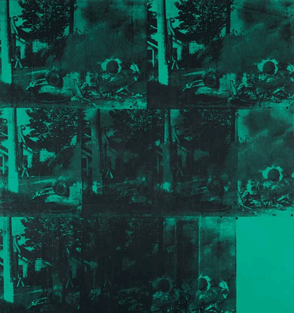
Overall, what I like is that the articles are brief and easy to read, and that these articles are interspersed with exhibit advertisements throughout the issue. There is also a section of book reviews so that one can be led to further reading if interested. Now I've come to the cover feature, entitled "Warhol Inc." It's pretty lengthy, but a great deal shorter than the articles I read in Art Journal. I'm going to go ahead and read it because our study of Warhol's art in class was very interesting. A quote in the article (from Tom Sokolowski of the Andy Warhol Museum) that I really like is this: "He [Warhol]...became the one who told the world how to become cool." And this definitely seems to be the case considering what the article teaches the reader about the sale of Warhol-edition Campbell soup cans for $2 a pack in rural Pennsylvania and Ohio in 2004, and for $48 a pack at Barneys in New York in 2006. This disparity is apparently due to Warhol's ability to appeal to both the low culture and the high culture. And since his death in 1987, people who belong to this high culture have paid millions of dollars (per painting) for his works. The article states that Warhol is most likely the biggest market in contemporary art, and not just in terms of dollars. His face and images are also everywhere: candy, clothing, porcelain, glass, perfume, watches, rugs, jewelry, and condoms. The article is finished perfectly with a quote from one of Warhol's friends who said, "He [Warhol] has energy still. He's just, you know, still alive."

Green Car Crash (Green Burning Car I) (1963), which sold for $71.7 million in 2007

New York fragrance company Bond No. 9's Andy Warhol Success is a Job in New York perfume, which is priced at $220 for 100 milliliters

In general, I've very much enjoyed reading ARTnews and remarking on the differences between its structure and composition and that of Art Journal. I wonder which journal I'll pick up for my next entry!

Kinsella, Eileen. "Warhol Inc." ARTnews 108 (2009): 86-93.

Wednesday, November 18, 2009

"Art Journal" (Fall 2009) Part II

Ok so, here is the promised entry about the Walter de Maria article from the Fall 2009 issue of Art Journal. The author is Jane McFadden and the title of the article is "Earthquakes, Photoworks, and Oz: Walter de Maria's Conceptual Art."

The article begins by referencing the cover of the May 1972 issue of Arts Magazine, a white cover with Walter de Maria's name and nothing else printed on it. The information given inside the magazine about the cover included information about De Maria's work in various deserts in 1968, and a quote from the artist himself saying, "Conceptual art need not be dependent on words or language." This quote definitely seems to fit with the bare and unadorned nature of the cover, and the fact that De Maria's "essays" of the time consisted of photographs only. What I'm learning is that he took his belief that Conceptual art need not depend on words beyond the pages of his essays. Apparently, De Maria was notorious for avoiding situations that would involve speaking about his work because he also believed that talking about one's art, or explaining it, is foolish.

This lack of language, speaking, and explanation seems to be related to the isolation he encountered in creating his works in the deserts of Nevada and other locations. Around that time, Walter de Maria remarked that you spend two or three hours driving to a valley, for example, and there's nothing there. Through his photographs, he wanted to emphasize the isolation and distance from the gallery. So far, what I'm learning from this article is something that I can't quite figure out how to phrase. It's about the nature of De Maria's work and how it lacks something that one might think it needs (text, explanation, gallery exhibition, etc.), but how it's not really lacking anything at all if it is taken as it is, for what it is. I'm still trying to figure out exactly what I'm thinking and what I want to say, so I'm going to continue reading.

The fact that his work in 1968 was beyond the "limits of photography" seems to be an important aspect. This meant that not many people would or could see the work because it involved travel, and therefore, was not readily accessible to everyone. However, De Maria stated that he preferred it that way. He would rather have only 20 people see one of his works than have a large number of people see his work in photographs because he believed that that would be "partially seeing" the work instead of fully seeing and experiencing it.

This makes me question why photographs of his work entitled The Lightning Field (1971-77), such as the one we saw in class, exist, and so I'm wondering if the article will address this issue. If this work was intended to be viewed over the course of a 24-hour period, then why would photographs, that cannot easily portray the element of change that is crucial to this work, be taken? Wouldn't this contribute to the possibility of a partial viewing, something that De Maria did not want to happen? This is also making me think of the discussions we've had in class about photographs and how we believe that they are representations of truth, despite the fact that they might not necessarily be. This definitely seems to tie into De Maria's stance on photography as an only "partial" way of viewing, seeing, and experiencing. Also, it is interesting that the article includes a quote in which De Maria says that he does not like to photographed, even though the article also includes a photo of De Maria smoking a pipe, originally from his very own essay on Conceptual art.

Anyway, I've now decided that I want to find somewhere in this article an explanation as to why photographs of The Lightning Field exist and have been published and disseminated, if such an explanation also happens to exist. I am finding some answers, incidentally. What I'm learning is that although documentation, such as photography, is incomplete and inadequate, it's necessary. And apparently De Maria understood this role of media in his work, perhaps explaining why De Maria published a nine-page photographic essay of The Lightning Field in the April 1980 issue of Artforum. And because he wanted his audience to understand that there was indeed a difference between experiencing his work and viewing his work, he chose to publish this essay in Artforum, where he could carefully control the presentation of his photographs. I guess I'm getting something of an answer because the article concludes with a statement about how De Maria truly created art that viewers experienced, whether in the field or on the page.


McFadden, Jane. "Earthquakes, Photoworks, and Oz: Walter de Maria's Conceptual Art." Art Journal 68 (2009): 68-88.

Tuesday, November 17, 2009

"Art Journal" (Fall 2009)

The Fall 2009 issue of Art Journal is the topic of this journal entry. Judith F. Rodenbeck writes that "in this issue, four masterful close readings demonstrate the importance not just of formal accuracy and precision but also of deeper contextualization, while a roundtable on the recent exhibition The Third Mind (Guggenheim Museum, 2009) addresses the complexities of transcultural influence and exchange."

While flipping through this issue, I'm noticing several works that we have studied in class. So I must admit, for this first journal entry, I'm going to play it somewhat safe and read further into works that are recognizable to me because of our class, such as the Minimalist art of Robert Morris and Donald Judd, and the Conceptual art of Walter de Maria.

The first article I'm going to read is "Jo Baer, Modernism, and Painting on the Edge" by Patricia Kelly. Kelly makes it known that the focus of this article is that "Baer's canvases promised the disinterested spectator participatory engagement, a tactic associated as much with performative practices as with the theatricality of Minimal art." Now I'm seeing why Donald Judd and Robert Morris works are included in this article. Apparently, the introduction of Minimalism, which was founded partly on the demise of painting, placed Judd and Robert in a situation of tension with Baer, who defended the currency and life of painting, and critiqued Minimalism. I'm also learning that although Baer aligned slightly with Clement Greenberg, she could not completely identify with his perspective because of her desire to radicalize contemporary painting. However, Baer was able to depart from Greenberg's legacy because it began to decline in influence by the 1960s, the decade in which Baer attempted to radicalize painting.

Reading this article is actually becoming really interesting, and I'm learning a lot that relates back to our class lectures. Baer's Stations of the Spectrum (Secondary) (1967-69) consists of three flat, gray canvases that are arranged horizontally. Each canvas has a black border and a thin color border (orange, purple, and yellow). However, the color of the color border seems to possess a different appearance depending on where the viewer stands, the angle of his or gaze, the lighting in the gallery, etc. I'm learning that although her focus on the experience of the spectator influenced by the spectator's body connected her to Minimalism, she also distanced herself from Minimalism by continuing to develop the concept of modern painting. Also, something that I find very interesting is that Baer contested Minimalism not just through certain aspects of her work, but also through writing critiques of Minimalism and by writing letters to certain Minimalist artists, such as Morris, about her concern for the future of painting because of Minimalist art's rejection of painting.


I'm really enjoying reading about how Baer radicalized painting. Basically, she brought science, biology or anatomy more specifically, into her paintings and demonstrated an understanding of how science has the power to influence the viewer's perception of a work of art. This relationship between science and painting is exemplified in Untitled (White Square Lavender) (1964-74), a painting that contains a large white field inside a lavender border inside a black border, and also happens to be the cover of this issue of Art Journal. This painting maximizes on two scientific theories in its ability to invoke the unique perception of each viewer: Mach Bands and retinal glare and scattering. To begin with, retinal glare and scattering adds luminance to the color band creating the illusion of the white rectangle moving beyond its boundaries. And Mach Bands, theorized by Austrin physicist Ernst Mach in 1865, creates even more luminosity in the lavender band because it is situated between areas of white and black, which contrast greatly. Because of this painting and its ability to create tension between how the artist paints the canvas and how the viewer sees the painting, it seems logical for Baer to have asserted that "a radical redefinition of current painting is pertinent and possible."


Ultimately, Baer ended up kind of blacklisted. Artforum refused to even review her work for submission because of her letter to Morris, and Greenberg rejected her work despite the fact that he was looking for the next new development in modern painting. Baer acknowledged this blacklisting and said that she knew she was going to get in trouble for not keeping quiet, but she felt that speaking out was the right thing to do.

It's taken so much time to look and mull over this article, that I'm thinking I will have to come back later to read the article about Walter de Maria. But I think that this has been an interesting start to a 4-week exploration of contemporary art journals!

Kelly, Patricia. "Jo Baer, Modernism, and Painting on the Edge." Art Journal 68 (2009): 52-67.